Plotting Basics in Matplotlib#
Author: Mike Wood
Learning objectives: By the end of this notebook, you should be able to:
Create simple plots to visualize one-dimensional data
Format line styles to change thickness, color, and marker style
Modify plot axes to add labels and legends, and change the grid appearance
Import the libraries for this notebook
# import the numpy and matplotlib libraries
import numpy as np
import matplotlib.pyplot as plt
Line Plots#
The most used function in the matplotlib library is the plot command, used for visualizing a pair of one-dimensional data sets. One-dimensional data can be provided as lists or 1D numpy arrays.
# define two simple lists of data lists x and y
x = [1, 2, 3, 4, 5]
y = [6, 11, 18, 24, 40]
# use the matplotlib plot command to plot x and y
plt.plot(x,y)

# use the show command to demo the plot below
plt.show()
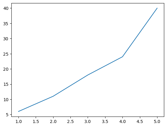
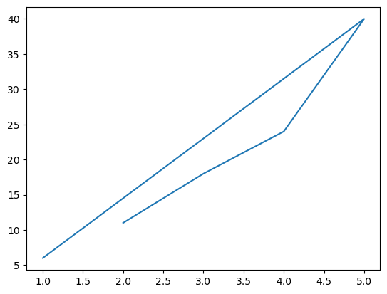
When plotting data, matplotlib will plot the data in the order that you provide it. Try shuffling your data lists and see how it changes the appearance of your plot.
# shuffle the x and y values in two new lists called x_new and y_new
x_new = [1, 5, 4, 3, 2]
y_new = [6, 40, 24, 18, 11]
# use the matplotlib plot command to plot x_new and y_new
plt.plot(x_new,y_new)

# use the show command to demo the plot below
plt.show()
Plots with multiple lines#
A single plot can be used to visualize as many datasets as you’d like. Define two sets of data based on the same independent variable and plot them on the same graph using multiple calls to the same plot.
# define a numpy array x with values between -1 and 1 in increments of 0.01
x = np.arange(-1, 1, 0.01)

# define y as 2*sin(x)
y = 2*np.sin(x)

# define z as identical to x
z = x
# use the matplotlib plot command to plot x and y
plt.plot(x,y)

# use the matplotlib plot command to plot x and z
plt.plot(x,z)

# use the show command to demo the plot below
plt.show()
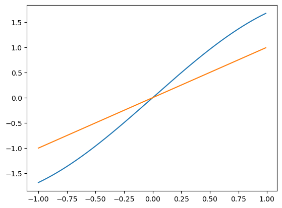
Figure Size#
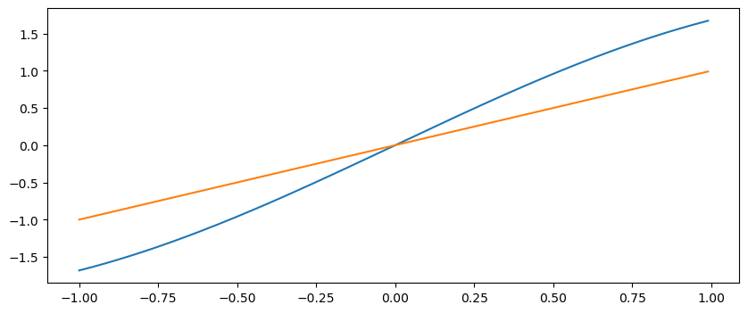
By default, matplotlib will generate your plot with a width of 8 inches and a height of 6 inches. However, you may like to change the shape of your plot to better represent your underlying data. To modify the plot shape, you can define a figure and use the figsize argument to reshape it as necessary.
# define a figure called fig and shape it to have a width of 10 and a height of 4
fig = plt.figure(figsize=(10,4))

# use the matplotlib plot command to plot x and y
plt.plot(x,y)

# use the matplotlib plot command to plot x and z
plt.plot(x,z)

# use the show command to demo the plot below
plt.show()
🤔 Mini-Exercise#
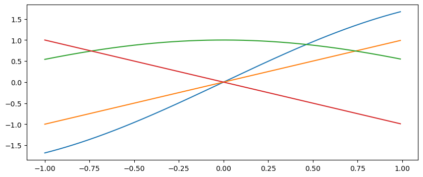
Goal: Extend the plot above to include two additional lines. Define new functions of your choosing that use x as the independent variable.
# define a figure called fig and shape it to have a width of 10 and a height of 4
fig = plt.figure(figsize=(10,4))

# use the matplotlib plot command to plot x and y
plt.plot(x,y)

# use the matplotlib plot command to plot x and z
plt.plot(x,z)

# use the matplotlib plot command to plot x and y
plt.plot(x,np.cos(x))

# use the matplotlib plot command to plot x and z
plt.plot(x,-x)

# use the show command to demo the plot below
plt.show()
Formatting Line Styles#
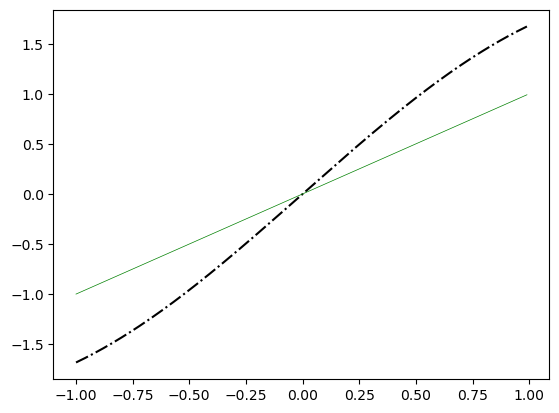
In the examples above, we saw that matplotlib automatically chose our line. Next, we will see how we can modify the appearance of our lines.
# define an independent variable x
x = np.arange(-1, 1, 0.01)

# define two dependent variables y and z as functions of x
y = 2*np.sin(x)
z = x
# make a new figure
fig = plt.figure()

# plot y and z vs x
# use the color keyword to change the color to one of your choosing
# use the linewidth keyword to change the width to one of your choosing
# use the linestyle keyword to change the style to one of your choosing
plt.plot(x, y,linestyle='-.', color = 'black')
plt.plot(x, z, linewidth = 0.5, color='green')
plt.show()
Line Styles#
Symbol |
Description |
Long Name |
|---|---|---|
- |
Solid Line |
solid |
– |
Dashed Line |
dashed |
-. |
Dashed and Dotted Line |
dashdot |
A list of all line styles is available at https://matplotlib.org/stable/gallery/lines_bars_and_markers/linestyles.html
Line Colors#
Color |
Short Symbol |
Long Name |
|---|---|---|
blue |
b |
blue |
black |
k |
black |
green |
g |
green |
red |
r |
red |
A list of all colors is available at https://matplotlib.org/stable/gallery/color/named_colors.html
Other useful keywords#
Keyword |
Description |
|---|---|
alpha |
transparency value (0-1) |
marker |
the symbol used for each data point |
marksize |
size of the marker on the data points |
Adding a Legend#
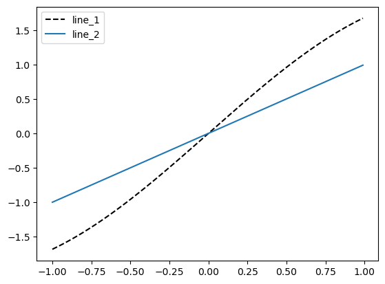
Legends can be added in Python by providing a label to each individual line that’s plotted. Then, the legend generator will add each label to the plots:
# create a new figure
fig = plt.figure()

# plot two lines, labeling them line_1 and line _2
plt.plot(x, y, 'k--', label='line_1')
plt.plot(x, z, label='line_2')

# add a legend
plt.legend()

# show the plot
plt.show()
Formatting Plot Axes#
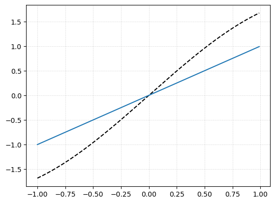
Once your lines are looking nice, the next thing we might want to do is adjust our axes to best represent our data. One way to make our plots more legible is to add grid lines:
# make a new plot figure
fig = plt.figure()

# plot two of the lines you used above
plt.plot(x, y,'k--')
plt.plot(x, z)

# add a grid to your plot
plt.grid(linestyle='--', linewidth = 0.5, alpha = 0.5)

# grids also have keywords for linestyle, linewidth, and alpha
# Try out different values to observe the plot appearance

# show the plot
plt.show()
Next, we might want to add axis labels to explain to our readers what variables we are looking at. Add labels to the x and y axes here:
# make a new plot figure
fig = plt.figure()

# plot two of the lines you used above
plt.plot(x, y,'k--')
plt.plot(x, z)

# add a grid to your plot
plt.grid(linestyle='--', linewidth = 0.5, alpha = 0.5)

# add labels to the x and y axes

# show the plot
plt.show()
By default matplotlib will determine where it would like to put the plot ticks. However, we may often want to change the location of our ticks to better represent our data:
# make a new plot figure
fig = plt.figure()

# plot two of the lines you used above
plt.plot(x, y,'k--')
plt.plot(x, z)

# add a grid to your plot
plt.grid(linestyle='--', linewidth = 0.5, alpha = 0.5)

# use the plt.gca().set_xticks command to provide
# a list where the axis ticks should be located
plt.gca().set_xticks([-1, -0.5, 0, 0.5, 1])
plt.gca().set_yticks([-1, -0.5, 0, 0.5, 1])

# show the plot
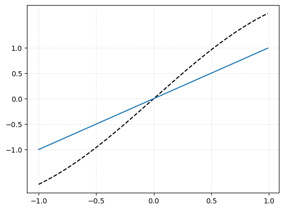
plt.show()