Learning Objectives: By the end of this lab, you should be able to
Start a QGIS project
Add vector layers to a map and modify their appearance
Add raster layers to a map and modify their appearance
Generate a map figure with a grid and a legend
Motivation
Geographical Information System (GIS) software provides a convenient way to explore data and make figures. We’ll start with a common map figure made in oceanography - a bathymetric map. This example will walk through the steps to create a simple map of the California coast around Monterey Bay like the one shown here:
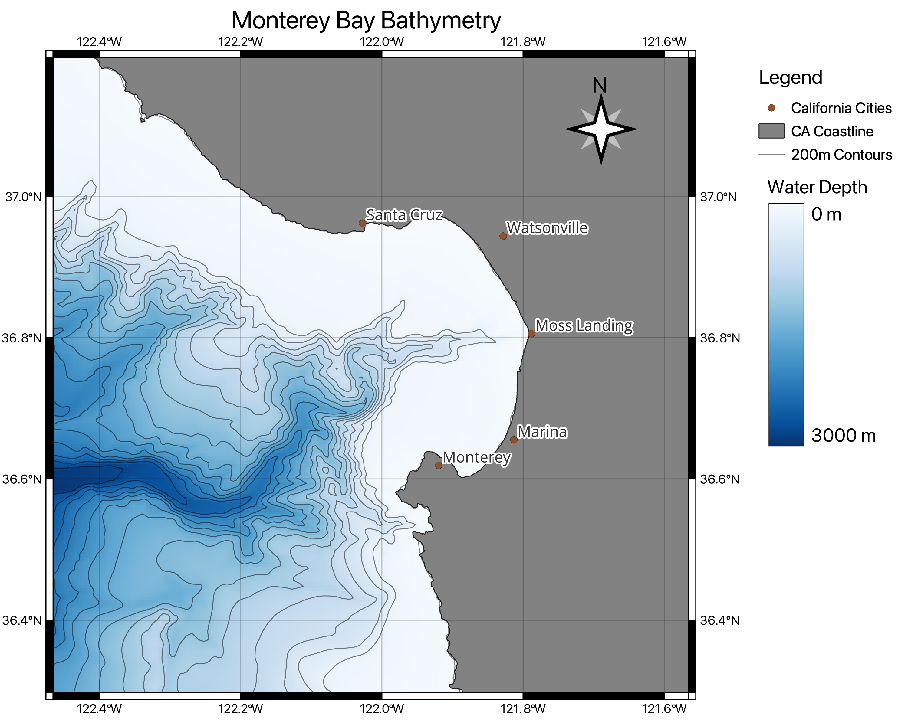
Figure 1:Screenshot of the figure generated in this lab showing the bathymetry of the Monterey Bay area.
This is a pretty basic map, but it will help us get acquainted with the different types of data in GIS and some of the tools provided with QGIS.
Getting Started
To get started with this lab, boot up QGIS. When the initial prompt comes up, choose to begin a New Project (or click on the white rectangle in the upper-left corner).
In your file system, create the following folder structure in your Lab folder:
Labs
 |-Lab 1
   |-Raster Layers
   |-Vector Layers
By default, QGIS will begin in “latitude-longitude” coordinates. You can double check this by checking that your projection says EPSG: 4326 in the lower right corner. We’ll discuss projections a bit more in the next lab.
To configure your view, I find that it’s easiest to choose to see the Layers panel and the map. You can edit the viewable panels from the View → Panels tab.
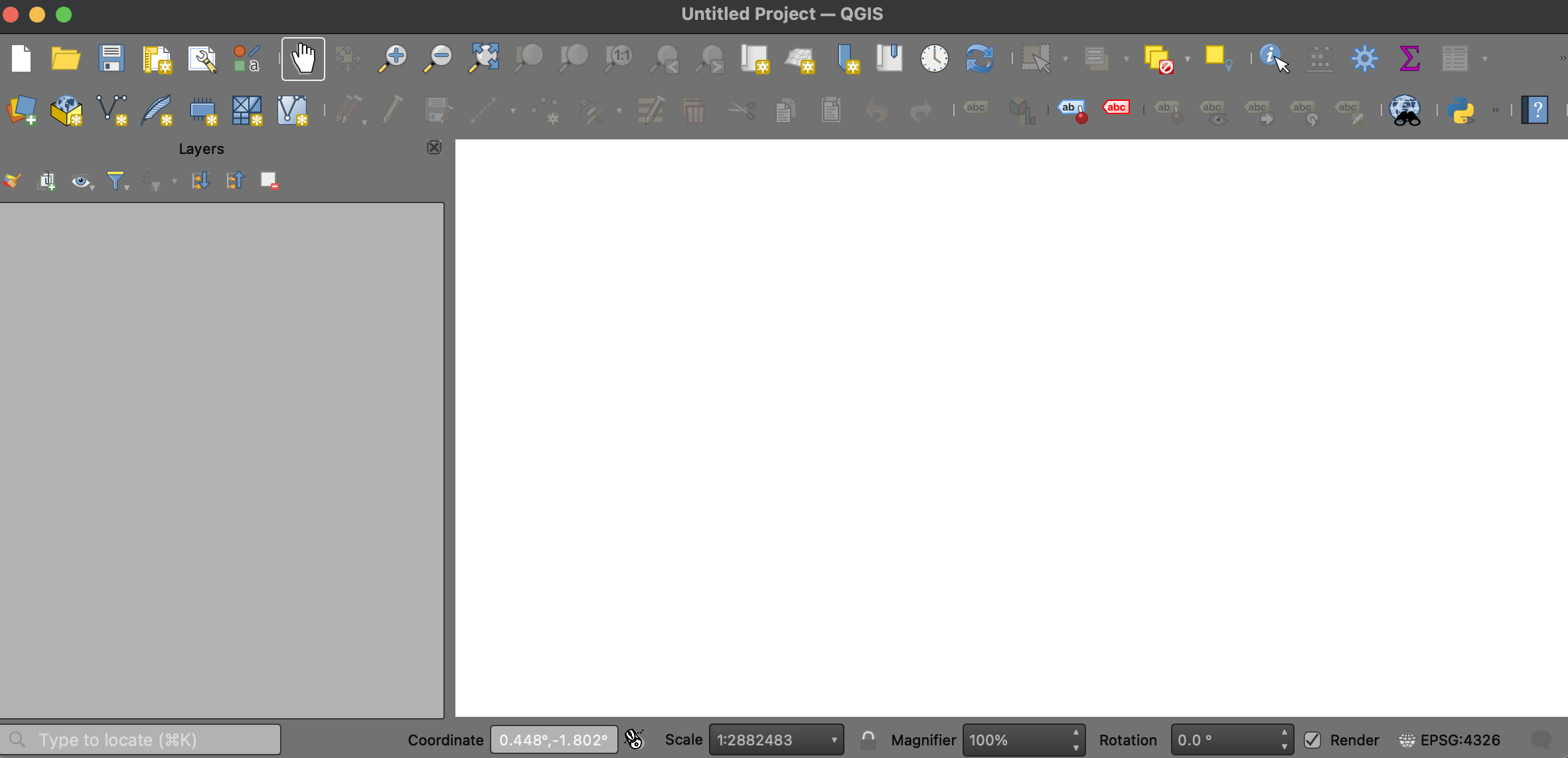
Figure 2:Screenshot of a new QGIS Project with the Layers Panel and Map View.
Once you’re happy with you setup, save your Project in your Lab 1 directory. It’s good practice to save your project in the correct place - and often! When working with lots of data at once, GIS programs tend to use lots of RAM and are prone to crashing. Saving often ensures you can always pick back up from where you started.
Part 1: Working with Vector Layers
There are a few different types of data in GIS programs. One type is a vector layer. Vector layers come in three main flavors:
Points (0 dimensional shapes)
Example: Sample collection locations, such as CTD casts
Lines (1 dimensional shapes)
Example: Transects, such as a research cruise track
Polygons (2 dimensional shapes)
Example: Area, such Marine Protected Areas
Vector layers are commonly distributed as shapefiles or possibly geopackages. Many public, academic, and research entities will distribute their data in shapefiles which can be downloaded from databases or generated by users in QGIS (or in programming languages! - more on this later.)
A First Shapefile: The Global Coastline
NOAA’s National Center for Environmental Information stores lots of different geospatial datasets. For this lab, we’ll download a shapefile of the global coastlines from NOAA’s Center for Environmental Information HERE.
Once you’ve obtained the global coastline file, unzip it and take a look at the contents inside the GSHHS_shp folder. Here, you will find five folders with the coastlines at different resolutions. According to the GSHHS documentation, these resolutions are organized as follows:
f: full resolution: Original (full) data resolution.
h: high resolution: About 80 % reduction in size and quality.
i: intermediate resolution: Another ~80 % reduction.
l: low resolution: Another ~80 % reduction.
c: crude resolution: Another ~80 % reduction.
When you access shapefile a object, you need a collection of files each with the same name and in the same location. Shapefiles require the following files:
.shp – the geometry of the feature
.shx – an index file for quicker queries
.dbf – attribute table with information for each shape
Shapefiles may also ship with additional layers including:
.prj – information on the projection (e.g. optional with “latitude-longitude” coordinates)
When you’ve downloaded your files, add the full or high resolution file to your map (GSHHS_f_L1.shp or GSHHS_h_L1.shp). Then, change the color of the polygons under the Properties tab of the layer (right-click on the layer).
A Second Shapefile: The U.S. States
The U.S. Census Bureau hosts shapefiles for official state boundaries. Download a shapefile of the state boundaries from from the Census Bureau HERE. Choose the option for the 1:500,000 (national) shapefile. Download your file into your Map folder.
When your file has downloaded, unzip it. Then, find the cb_2025_us_state_500k.zip file and unzip that one too. Finally, add the cb_2025_us_state_500k.shp file to your map. When your shapefile loads, you may get a message about the projection - just choose the default in this case (more on projections in the next lab).
When the polygon is on the map, change the color to something that suits your artistic preferences.
In addition to geometric information, each shape in a shapefile also contains lots of metadata about each shape. Right-click on the layer and choose Open Attribute Table. In the states shapefile, you can see that each shape has some IDs, its name, and the areas of water and land in the state:
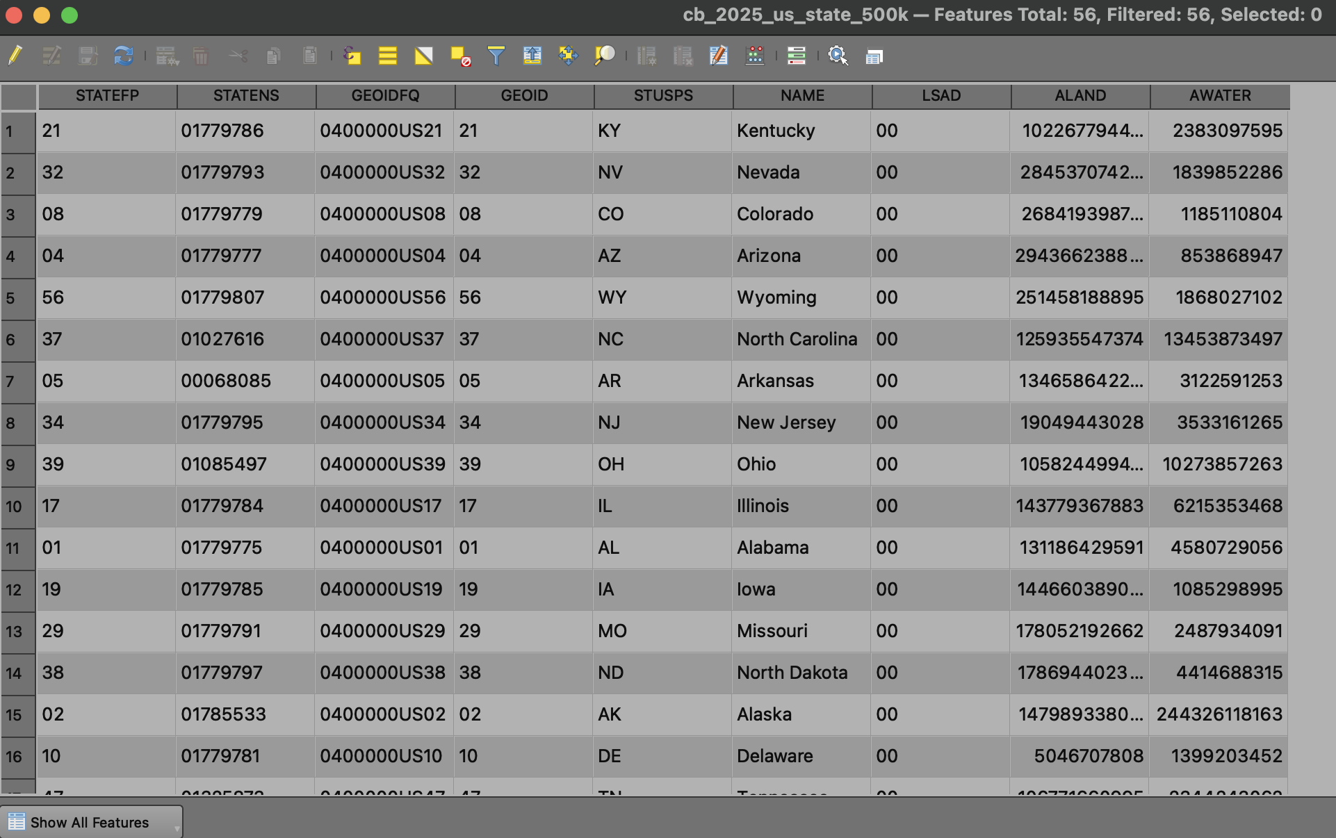
Figure 3:Screenshot of the attribute table from the U.S. Census Bureau states shapefile.
These attributes can be used to label each of the shapes on your map. For example, say we want to label each shape with the name of the shape. Right-click on the shape layer name and choose Properties. Then, under the Labels tab, choose Single Labels and select NAME from the dropdown. You can change the style options if you like (e.g. font sizes, buffers, etc.) - take a moment to explore the options.
A Third Shapefile: California Cities
In addition to obtaining a shapefile, we can also create our own shapefiles. Start by choosing Layer → Create Layer → New Shapefile Layer. In the File name section of the layer menu, click on the three dots next to the layer name and find your folder for this lab. Then enter the name California Cities. Next, for the Geometry type, choose Point.
In the New Field Section, enter City_Name and click Add to Fields. In the section below, you can remove the id field if you’d like. Then, click OK to make the layer.
Now that you’ve created your shapefile, you can add some points for different cities. Highlight the California Cities in your layers tab, and click on the yellow pencil icon to enter edit mode. Then select the Add Point Feature tool (which looks like three green dots). This will allow you to click on locations in your map to add features. For example, find Moss Landing on the map and click to add a feature. In the box for City_Name, enter Moss Landing. Add four more cities to orient users to your map. When you’re done editing, click the yellow pencil icon one more time to exit edit mode.
After you’ve added your layers, change the properties of your shapefile so that the points are visible and each point is labeled with the city name.
Part 2: Working with Raster Layers
Rasterlayers are designed to represent 2D gridded data and are therefore quite common in remote sensing. Most satellite datasets are distributed as raster layers. Raster files inherently have a resolution (or a “posting”) which describes the size and spacing of each cell. Raster layers are commonly distributed as Geotiffs (which have the extension tif, tiff, or TIFF). Recently, NetCDF (nc) files have been designed to be used as raster layers in GIS applications as well.
The General Bathymetric Chart of the Oceans
The General Bathymetric Chart of the Oceans (GEBCO) is a compilation of ocean floor measurements from all over the world from a wide range of sources. The whole grid is pretty big – several GB in one file.
To access data in a more user-friendly way, user-defined regions can be defined on a subset of the globe. To access a subset of GEBCO, navigate to the viewer HERE
On this page, click on Select Subset Option enter the approximate bounds for a big area around the Monterey Bay region as follows:
latitude: 31°N to 43°N
longitude -128°E to -114°E
Then, download a GeoTIFF version of the Bathymetry data into your Map folder. Your selection should appear like the following screenshot:
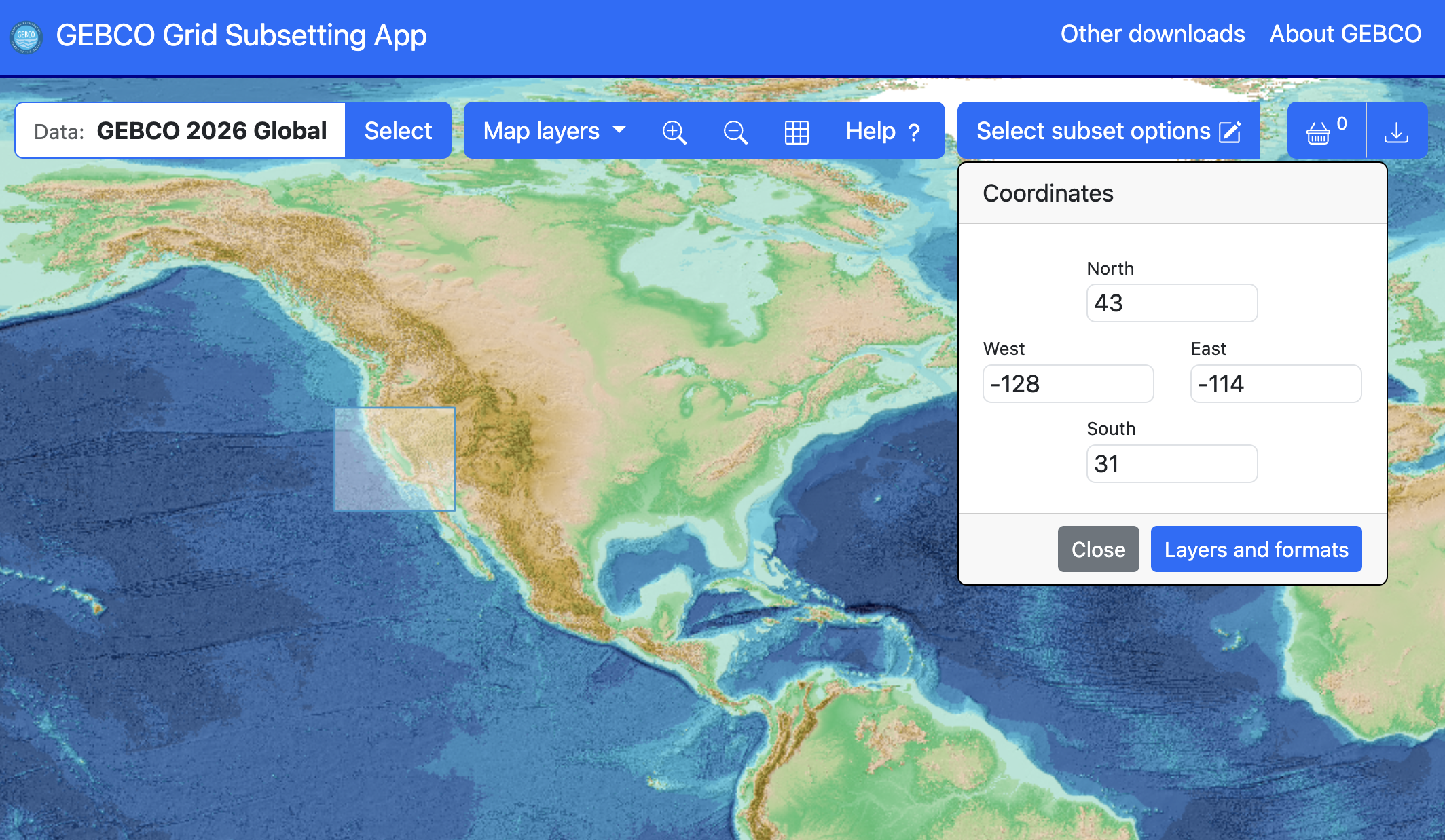
Figure 4:Selection of Monterey Bay bathymetry from GEBCO.
Formatting Raster Layers
Once you’ve obtained your file (and stored it in your lab folder) add the GeoTIFF to the map using Layer → Add Layer → Add Raster Layer.
Next, move the raster layer to the bottom of the layers list so that it appears underneath the land layers.
By default, a raster layer will be assigned a black/white colormap and be stretched to include all possible values in the range. To change this default behavior, right-click on the layer, choose Properties, and select the Symbology tab. Next, change the Render Type from Singleband gray to Singleband pseudocolor. This will allow you to choose a new colorbar and range. I find that the Blues colorbar gives an intuitive interpretation of depth. Choose this color ramp, choose to Invert Color Ramp from the dropdown, and edit the Min and Max values to -3000 and 0.
Computing Contours
In addition to colormaps for interpreting raster data, contours can help guide the eye to important features. To compute contours, select the Raster → Extraction → Contour tool. In the interval between contour lines, choose 200. Then, in the Contours section, click on the three dots to choose a location for your file (your lab folder!). Name the file something sensible (e.g. Bathymetry Contours) and make sure the file type is a shapefile (.shp). Then, click Run.
After the contours are added to the map, change the appearance to look nice on the map. I find that a black color with 50% transparency works well.
Part 3: Generating a Figure
After you’ve added and stylized all of the data you’d like to have on your map, the next step is to generate a nice figure. The Layout Manager tool provides a convenient way to generate a figure.
The Layout Manager
The Layout Manager in QGIS allows you to make a nice figure with your map complete with legend, color bars, and the like. To open the Layout Manager, choose Project → New Print Layout. Label your project something sensible like “Monterey Bay Bathymetry”. This will open a new Layout Manager for creating a figure, as shown in the following screenshot:
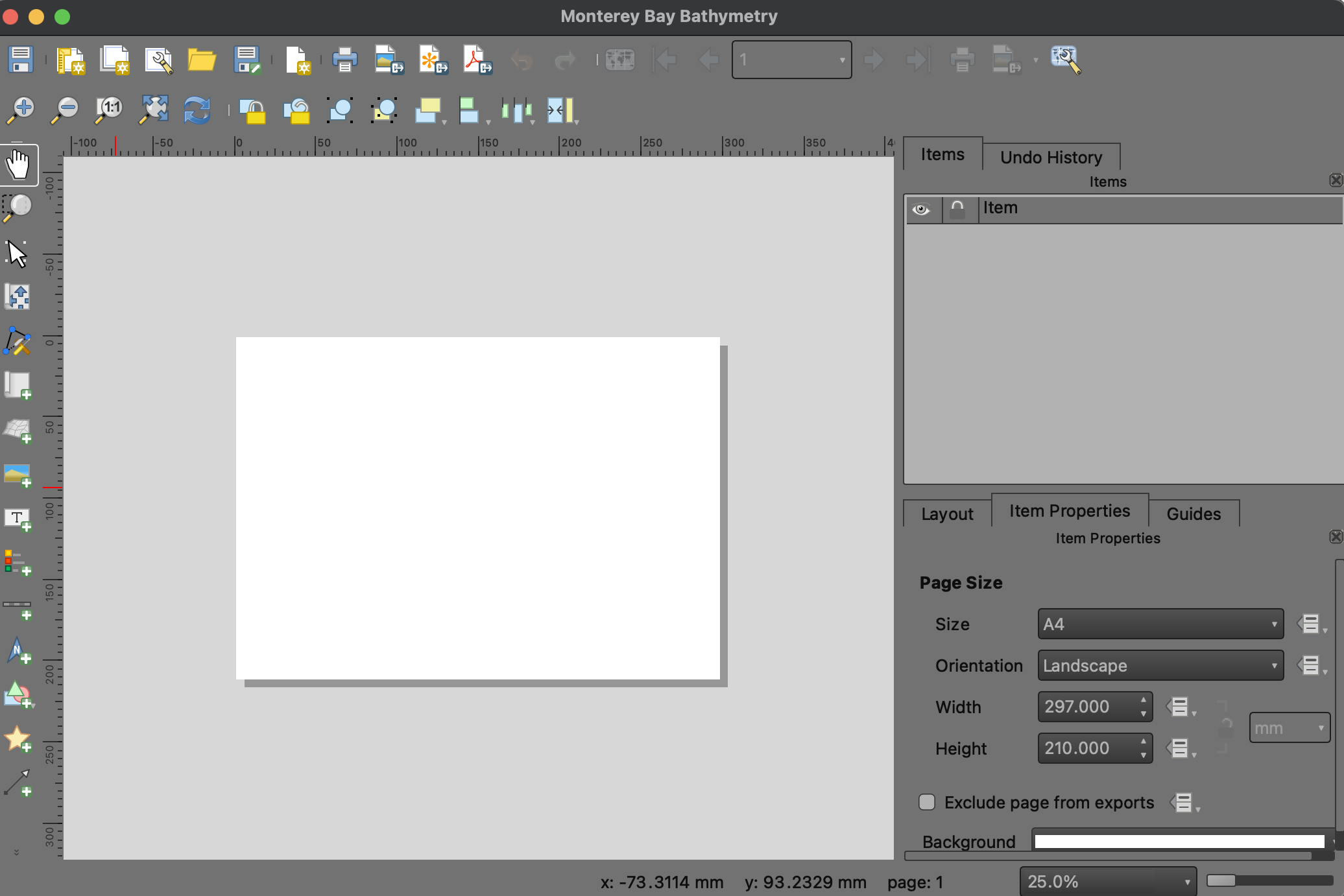
Figure 5:Secreenshot of a blank Layout Manager for the Monterey Bay bathymetry map.
You can always access previous Layout Managers from the Project dropdown after they are created if you want/need to edit previous maps.
Once you’ve got a new layout set up, you can set the dimensions for your figure. Under the Items Property tab of the Items panel, set your Page Size as desired. For example, if you’d like a figure with a width of 10" and height of 8", you can choose the custom option, change the units to inches, and set these accordingly.
Adding Map Layers
To add your map to your figure, use the Add Map tool from the left panel. Drag out a rectangle for the approximate area of your map. If you want to change your map size in your layout, you can access all sorts of attributes about your map in the Layout tab. In this example, I’ll format the map to be sized 7" by 7".
Once you create your map object, you can edit the scale and location (relative to your global map in the main map layout) using the Move Item Content tool.
Adding Grid Lines to a Map
When you’re happy with the size and location of your map, it is good practice to add grid lines to the map to orient your readers to the location. Under the Item Properties tab of the Items pane, you’ll find a section for Grid (make sure your map object is highlighted in the Items list.) Hit the green plus button to add a new Grid to the map.
To format your grid, you can determine the grid spacing and how it is rendered and labeled on your map. For the Monterey Bay map, an X and Y spacing of 0.2° each seems to be a suitable spacing. To move these into the background, the transparency can be adjusted to a value about 20%.
After the grid has been created, add a Frame and style it according to your preferences (I like Zebra!). You can also choose to draw the coordinates on each side and label them with appropriate units. For example, at this resolution, labeling with the N and W labels and formatting one decimal point precision is appropriate.
Adding a Legend
Add a legend using the Add a Legend Tool. Note that the legend will be generated from available layers and given the names as they are recorded in your main map. You can edit the legend by unchecking the Auto Update feature and adding/removing/renaming features as you see fit.
Adding Other Map Layers
Other map layers can be added with the tools at the left. Try it for yourself – see if you can add the following layers to the map:
A title
A compass rose
A note indicating the author and date
A custom colorbar (challenge!)
Exporting Your Figure
When you’re happy with your figure, use the Export as Image button from the top panel or the File dropdown.