In this notebook, we will examine a new classification problem using a -Nearest Neighbors model.
Learning Outcomes
Describe how a data set is used to compute classifications on unseen data using a -Nearest Neighbors (KNN) classifier
Implement a KNN classification model from scratch
Implement a KNN classification model from the
scikit-learnpackage
Import modules
Begin by importing the modules to be used in this notebook
import os
import numpy as np
import matplotlib.pyplot as plt
import pandas as pd
import classifier_helper_functions as hf
from sklearn.neighbors import KNeighborsClassifier
Yet Another Classification Problem
When oceanographers investigate the global-scale circulation in the ocean, the often water masses distinguished by different temperatures, salinities, and therefore densities. For example, consider thr following transect through the middle of the Atlantic Ocean going from the south pole on the left to the north pole on the right:
latitude, Z, depth, theta_grid, salt_grid = hf.read_ocean_transects(data_dir=os.path.join('..','data'))hf.plot_crosssection(latitude, Z, depth, theta_grid, salt_grid)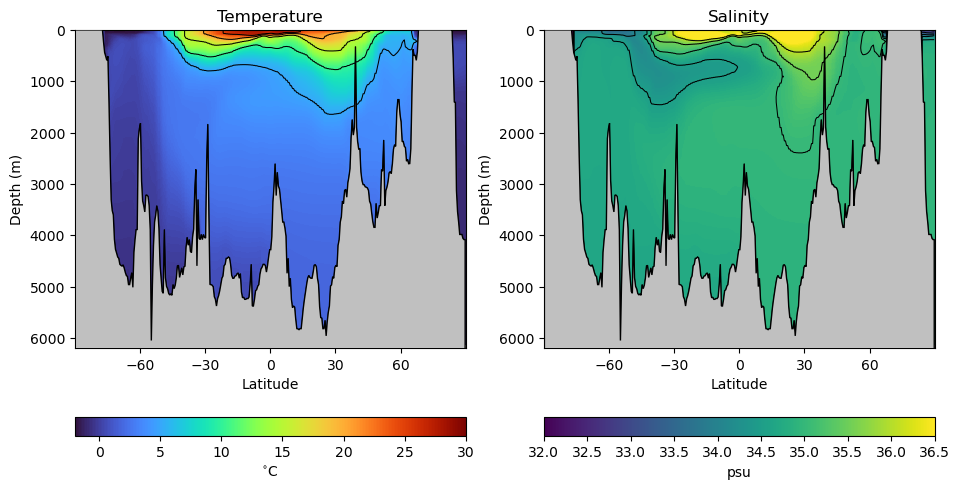
As we can see, there are variations in ocean temperature and salinity in both the vertical and latitudinal directions. But how are these water masses connected? We can get a sense by looking at different classifications of these properties based on samples from the real ocean. Let’s read in a data set with different water masses:
df = pd.read_csv(os.path.join('..','data','water_mass_samples.csv'))
df.head()In the data set above, each row in the data frame has a temperature and salinity value as well as a corresponding classification of its water mass - in other words, which waters it was sampled from. Unlike the previous binary classifications, there are more than just 2 classifications here. Let’s see how many classifications there are:
watermasses = list(df['WaterMass'].unique())
watermasses
['NACW', 'SACW', 'AAIW', 'MOW', 'NADW', 'AABW', 'NPCW', 'SPCW', 'NPIW', 'PDW']watermasses_long = list(df['WaterMass_LongName'].unique())
watermasses_long['North Atlantic Central Water',
'South Atlantic Central Water',
'Antarctic Intermediate Water',
'Mediterranean Outflow Water',
'North Atlantic Deep Water',
'Antarctic Bottom Water',
'North Pacific Central Water',
'South Pacific Central Water',
'North Pacific Intermediate Water',
'Pacific Deep Water']That’s 10 different water masses in our dataset!
Just like our previous examples, we’ll need to encode a classification number for each one - a number 0-9 that maps the classification name to an integer we can use in computations. Let’s do that below:
mass_to_number = {}
for i in range(len(watermasses)):
    mass_to_number[watermasses[i]]=i

# Create the new column using map
df['WaterMassIndex'] = df['WaterMass'].map(mass_to_number)
We can check the header and footer of our data frame to ensure this indexing was assigned appropriately:
df.head()df.tail()So far so good! Since we’re going to be plotting the same dataset a few times, let’s define a common set of bounds for our axes:
# define some bounds to be used in the plots below
min_S = 33.8
max_S = 37.2
min_T = -1
max_T = 18
Next, let’s plot the data on a temperature-salinity diagram - an oceanographer’s favorite diagram:
colors = plt.rcParams['axes.prop_cycle'].by_key()['color']

for w, watermass, in enumerate(watermasses):
    plt.plot(df[df['WaterMass']==watermass]['Salinity_PSU'],
             df[df['WaterMass']==watermass]['Temperature_C'],
             '.', label=watermasses_long[w], color=colors[w])
plt.gca().set_xlim([min_S,max_S])
plt.gca().set_ylim([min_T,max_T])
plt.ylabel('Temperature (C)')
plt.xlabel('Salinity (PSU)')
plt.legend(loc="center left", bbox_to_anchor=(1, 0.5))
plt.show()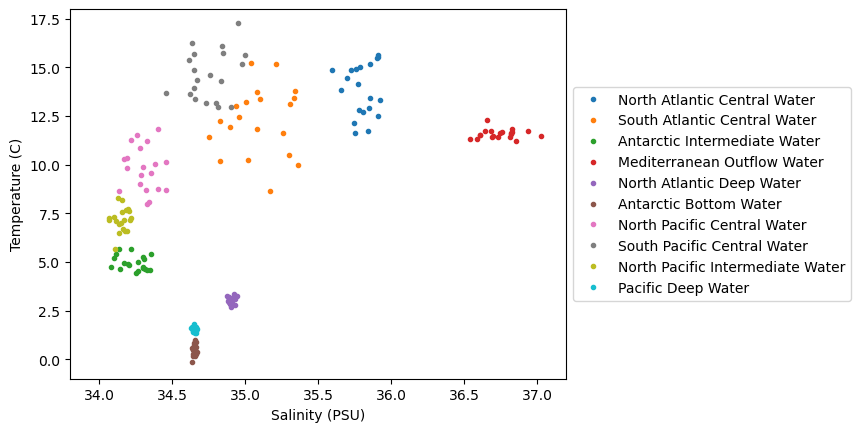
We can see in this dataset that there is are some clusters of points in these diagrams, but they are not all unique - there are some overlapping sections. Let’s see how we can go about classifying various parts of this diagram, even for unknown regions.
-Nearest Neighbors
The first example we’ll look at is the -Nearest Neighbors classifier, or KNN for short. The KNN classifier is pretty simple, and the rules are as follows:
For a given point in the parameter space (i.e. given a temperature and salinity value),
Find the “closest” points
Find the most common classification for the closest points
Assign the classification to the new point
Turns out this KNN model is coded up conveniently in scikit-learn, Let’s see how we can implement this model:
# initialize the data arrays as numpy arrays
X = df[['Salinity_PSU','Temperature_C']].to_numpy()
c = df['WaterMassIndex'].to_numpy()

# create the knn object
knn = KNeighborsClassifier(n_neighbors=3)
knn.fit(X, c);
Now, use the predict method to apply the model to a range of points in the temperature-salinity space:
# make a range of points in the space
salinity = np.linspace(min_S,max_S,100)
temperature = np.linspace(min_T,max_T,100)
Salinity,Temperature = np.meshgrid(salinity,temperature)

# apply the model
WaterMassIndices = knn.predict(np.column_stack([Salinity.ravel(),Temperature.ravel()]))
WaterMassIndices = WaterMassIndices.reshape(np.shape(Salinity))
Let’s plot the model classifications along with our data to see how things look:
# plot the model classifications
C = plt.pcolormesh(Salinity, Temperature, WaterMassIndices, cmap='tab10',
                   alpha=0.5, vmin=0, vmax=len(watermasses_long))
cbar = plt.colorbar(C, ticks=np.arange(len(watermasses_long))+0.5)
cbar.set_ticklabels(watermasses_long)

# plot the data
for w, watermass, in enumerate(watermasses):
    plt.plot(df[df['WaterMass']==watermass]['Salinity_PSU'],
             df[df['WaterMass']==watermass]['Temperature_C'],
             '.', label=watermass, color=colors[w])

plt.ylabel('Temperature (C)')
plt.xlabel('Salinity (PSU)')
plt.show()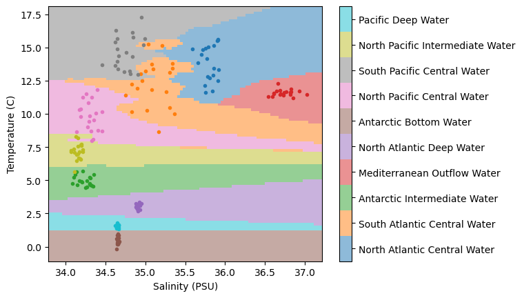
Not too bad... we have regions of similar classifications around clusters of points. But we also have some “streaks”, particularly in the region in the lower right-hand side of the plot. What’s causing those?
It turns out, those streaks are the result of the distance formula used when computing the “closest” points. The distance formula used is the Euclidean distance - the one we learn as the “Pythagorean Theorem” in school. And the thing about the Euclidean distance is that it assumes the magnitude of the data is the same. However, if we take a look at the plot, that’s not the case - the temperature range is much larger than the salinity range!
Again, we need to standarize our data - let’s apply our usual transformations and try out model again:
# standardize the data
salt_normalized = (df['Salinity_PSU']-min_S)/(max_S-min_S)
temp_normalized = (df['Temperature_C']-min_T)/(max_T-min_T)

# recreate the input data
X = np.column_stack([salt_normalized,temp_normalized])

# initialize a model to the new data
knn = KNeighborsClassifier(n_neighbors=3)
knn.fit(X, c);
Now, just as before, let’s see how our model performs in the entire (normalized) temperature-salinity space:
salinity_norm = (np.linspace(min_S,max_S,100)-min_S)/(max_S-min_S)
temperature_norm = (np.linspace(min_T,max_T,100)-min_T)/(max_T-min_T)
Salinity_norm,Temperature_norm = np.meshgrid(salinity_norm ,temperature_norm)
WaterMassIndices = knn.predict(np.column_stack([Salinity_norm.ravel(),Temperature_norm.ravel()]))
WaterMassIndices = WaterMassIndices.reshape(np.shape(Salinity_norm))
C = plt.pcolormesh(Salinity, Temperature, WaterMassIndices, cmap='tab10',
alpha=0.5, vmin=0, vmax=len(watermasses_long))
cbar = plt.colorbar(C, ticks=np.arange(len(watermasses_long))+0.5)
cbar.set_ticklabels(watermasses_long)
for w, watermass, in enumerate(watermasses):
plt.plot(df[df['WaterMass']==watermass]['Salinity_PSU'],
df[df['WaterMass']==watermass]['Temperature_C'],
'.', label=watermass, color=colors[w])
plt.ylabel('Temperature (C)')
plt.xlabel('Salinity (PSU)')
plt.show()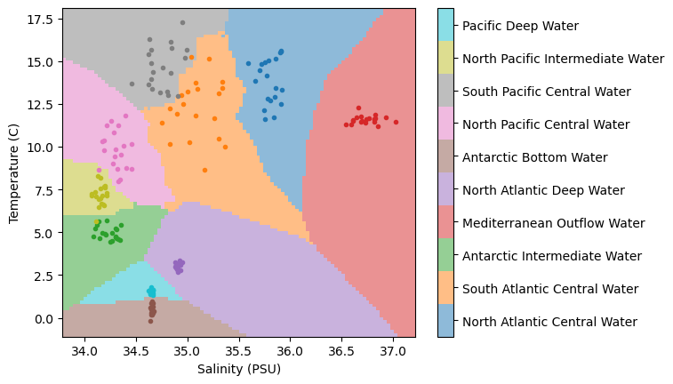
Wow, much different than before!
🤔 Test your intuition
In the model above, we have chosen for our neighbors. What do the results look like if you increase or decrease this parameter?
Applying the model to the transect data
Now that we’ve got our classification model in hand, we can test it out on our transect data. Let’s normalize our data and pass it through our classifier:
# normalize the salinity and temperature grids
Salinity_norm = (salt_grid-min_S)/(max_S-min_S)
Temperature_norm = (theta_grid-min_T)/(max_T-min_T)

# estimate the water mass classifications using the KNN classifier
WaterMassIndices_knn = knn.predict(np.column_stack([Salinity_norm.ravel(),Temperature_norm.ravel()]))
WaterMassIndices_knn = WaterMassIndices_knn.reshape(np.shape(Salinity_norm))
Next, let’s plot the results on a transect:
hf.plot_classification_crosssection(latitude, Z, depth, WaterMassIndices_knn, watermasses_long) 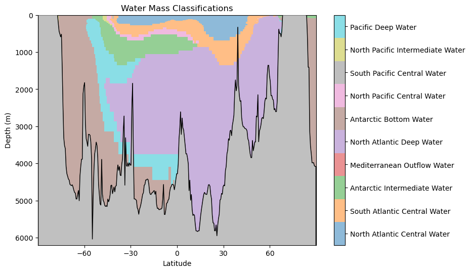
What features do you observe in this classification? What aligns with your oceanographic expectations? Anything unusual?
Key Takeaways
The -Nearest Neighbor (KNN) classifier is capable of assigning classification in non-linear regions of the feature space.
The KNN classifier is based on simple rules guided by the available data and their classifications.
Normalizing the input features to the KNN is important to prevent one parameter from biasing the results.