In this notebook, we’ll take a look at an oceanographic application of clustering.
Begin by reading in the modules needed for this notebook:
import os
import numpy as np
import matplotlib.pyplot as plt
import netCDF4 as nc4
from sklearn.cluster import KMeans, DBSCAN, OPTICS
import turbulence_example_helper_functions as tehfMotivation
In this example, we’ll take a look at a relatively common scenario in oceanography. Suppose that you have gone out on an oceanographic vessel and collected measurements along a transect. At each sample location, you lower an instrument that measures temperature, pressure, and a few other parameters. Since you are interested in mixing and stratification along this transect, you use your measurements to compute the kinetic energy dissipation rate () and the squared Brunt-Väisälä frequency (N). Now, you have a collection of these profiles for each transect, you ask: how do you begin to look for patterns in your data? One option is to use a clustering technique with your data. In this approach, you identify similar patterns in your data according to your collected parameters. Let’s have a look.
Note: This example uses data collected and processed by MLML graduate student Jo Trillo for her MLML Master’s thesis project. Here, we will only use a subset of her profiling data. This approach is inspired by the by Couchman et al 2021 who used a similar clustering approach for their data collected near Velasco Reef in Palau.
Read in the Data
The data for this example is provided in a concise, pre-processed netCDF file. We can read in this data using a script is provided with this notebook:
transect_sets, column_names =\
    tehf.read_turbulence_profiles(os.path.join('..','data','turbulence_profiles.nc'))
The transect_sets object is a nested dictionary with 10 sub-dictionaries corresponding to transect numbers (1-10) and entries corresponding to the profiles (1-9 for each transect). For example, if we wanted to obtain the 5th profile on transect 2, we could obtain this as follows:
profile_5_2 = transect_sets[5][2]Note that the counting is not “Python” counting. In this profile, there are 5 columns as listed in the column_names list:
column_names['pressure', 'epsilon', 'N2', 'temperature', 'distance']Let’s take a look at the profiles for , N, and temperature:
plt.figure(figsize=(10,4))
plt.subplot(1,3,1)
plt.plot(np.log10(profile_5_2[:,1]), profile_5_2[:,0], 'k-')
plt.xlabel('log$_{10}$ ($\\varepsilon$, W/kg)')
plt.ylabel('pressure (dbar)')
plt.ylim([np.max(profile_5_2[:,0]), 0])

plt.subplot(1,3,2)
plt.plot(np.log10(profile_5_2[:,2]), profile_5_2[:,0], 'k-')
plt.xlabel('log$_{10}$ (N$^2$, s$^{-2}$)')
plt.ylim([np.max(profile_5_2[:,0]), 0])

plt.subplot(1,3,3)
plt.plot(profile_5_2[:,3], profile_5_2[:,0], 'k-')
plt.xlabel('Temperature ($^{\\circ}$C)')
plt.ylim([np.max(profile_5_2[:,0]), 0])

plt.show()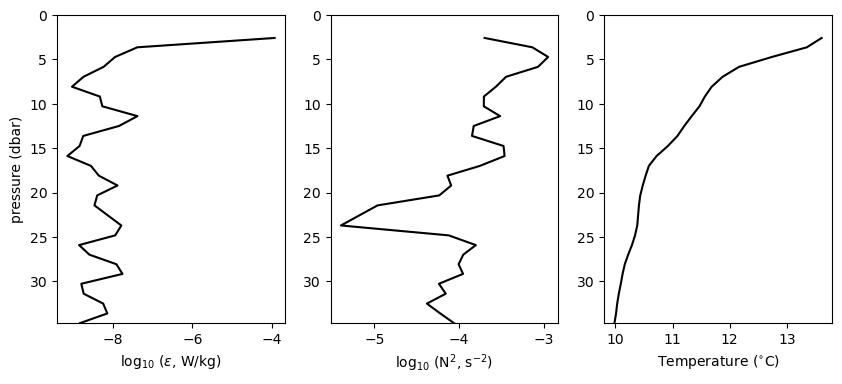
Visualizing the transects
Since these profiles were collected along transect, it’s helpful to visualize them in terms of the distance along the transect. The provided script provides a convenient function for this type of plot. Note that you can pass in the key words “epsilon”, “N2”, or “temperature” to generate the plot for that data:
tehf.plot_transect_profiles(transect_sets, 'temperature')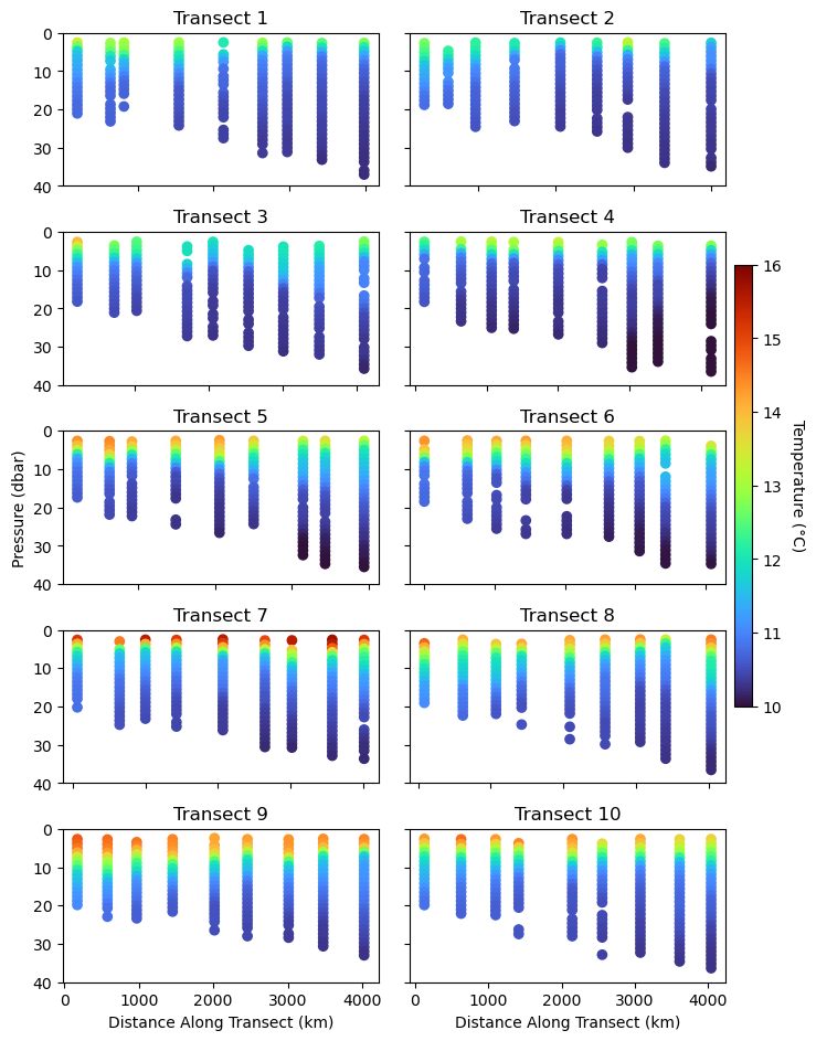
By changing the variable plotted above, you likely noticed some differences between the variables. However, it’s a little difficult to track these differences across the different variables and transect - this is where a clustering approach can help us out.
Clustering
In the steps below, we will assign unique values to groups of different data. For example, one prominent group might be warm, stable, near-surface waters. We will do this using the clustering algorithms introduced in the previous notebooks. As for any machine learning algorithm, first we will need our design matrix:
# make an empty list for the profile stack
profiles = []

# make an empty list for the transect and profile numbers
transect_profile_numbers = []

# loop through each profile and add it to the list
for transect_number in transect_sets.keys():
    for profile_number in transect_sets[transect_number].keys():
        profile = transect_sets[transect_number][profile_number].copy()
        profile = np.column_stack([profile[:,1], profile[:,2], profile[:,3]])

        # now, log transform epsilon and N2
        profile[:,0] = np.log10(profile[:,0])
        profile[:,1] = np.log10(profile[:,1])

        # non_nan_indices = np.logical_and(~np.isnan(profile[:,0]), ~np.isnan(profile[:,1]))
        # profile = profile[non_nan_indices, :]
        profiles.append(profile)
        transect_profile_number = np.ones_like(profile[:,:2])
        transect_profile_number[:,0] *= transect_number
        transect_profile_number[:,1] *= profile_number
        transect_profile_numbers.append(transect_profile_number)

# construct the design matrix
X = np.vstack(profiles)
TP = np.vstack(transect_profile_numbers)
Before applying our clustering algorithm we need to standardize the data as each variable is on a different scale:
X_std = (X - np.nanmean(X, axis=0)) / np.nanstd(X, axis=0)With our data in hand, we’re ready to test out our clustering algorithm. As a first guess, let’s use the simple -Means clustering:
n_clusters = 5
C = KMeans(n_clusters=n_clusters, random_state=0).fit_predict(X_std)
Visualize the Clustering Results
Let’s have a look at our clustering results. Since our data is three-dimensional (, N, and temperature), we can look at our clustering results along “orthogonal” axes between variables:
unique_clusters = np.unique(C)

fig = plt.figure(figsize=(15, 4))
plt.subplot(1,3,1)
for cluster in unique_clusters:
    cluster_points = X[C == cluster]
    plt.scatter(cluster_points[:, 0], cluster_points[:, 1], label='Cluster ' + str(cluster))
plt.xlabel('log10($\\varepsilon$)')
plt.ylabel('log10(N$^2$)')
plt.legend()

plt.subplot(1,3,2)
for cluster in unique_clusters:
    cluster_points = X[C == cluster]
    plt.scatter(cluster_points[:, 0], cluster_points[:, 2], label='Cluster ' + str(cluster))
plt.xlabel('log10($\\varepsilon$)')
plt.ylabel('Temperature (°C)')

plt.subplot(1,3,3)
for cluster in unique_clusters:
    cluster_points = X[C == cluster]
    plt.scatter(cluster_points[:, 1], cluster_points[:, 2], label='Cluster ' + str(cluster))
plt.xlabel('log10(N$^2$)')
plt.ylabel('Temperature (°C)')

plt.show()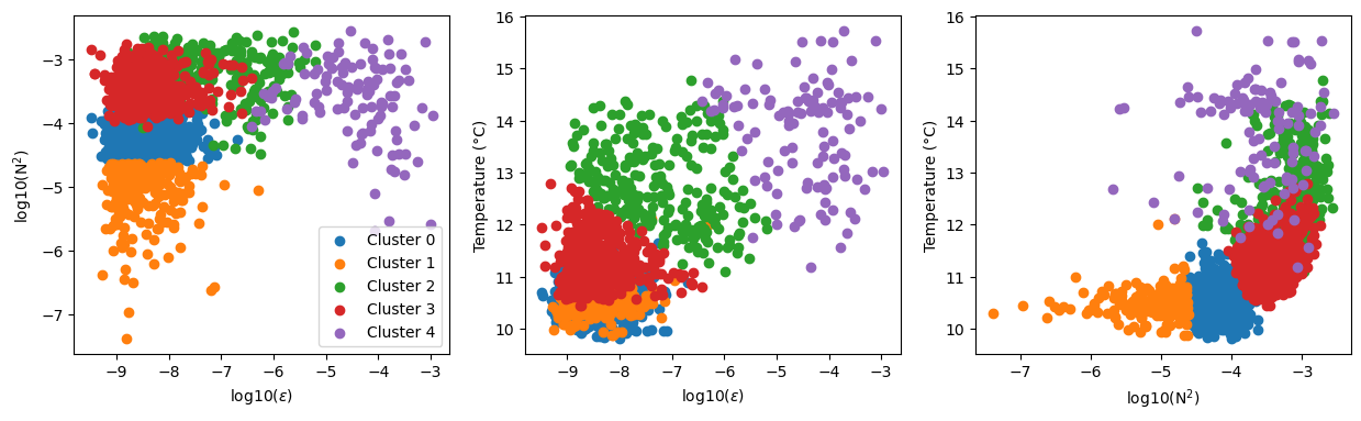
From these results, we can see that our clustering is picking out domains in each variable space corresponding to a given regime. For example, cluster 3 corresponds to highly stable, low mixing regime with moderate temperature. Let’s see where that cluster sits in the water column. Again, a helper function is used for this plot:
tehf.plot_clustering_results(transect_sets, C, TP, n_clusters, plot_cluster=3)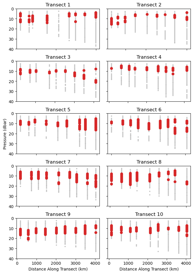
In the above example, we can see that the cluster 3 water is typically positioned at a depth of 5-20 m but there are significant variations between and across transects. This analysis could provide a valuable starting points for investigating different mixing regimes in this region of the ocean.
🤔 Try it yourself
There’s a lot to explore in this data. Using the example above try out the following:
Examine the depths of other clustered points in the water column. Does this match with you intuition?
Try out different numbers of clusters in the -Means algorithm. How do the number of clusters change the result?
Try our a different clustering algorithm. In the previous notebook, we saw two example of density-based clustering (DBSCAN and OPTICS). How do the results of these algorithms compare to that from -means?
- Couchman, M. M. P., Wynne‐Cattanach, B., Alford, M. H., Caulfield, C. P., Kerswell, R. R., MacKinnon, J. A., & Voet, G. (2021). Data‐Driven Identification of Turbulent Oceanic Mixing From Observational Microstructure Data. Geophysical Research Letters, 48(23). 10.1029/2021gl094978